Signal Processing: 1D Signals
Project && Guide
Table of Contents
- Overview
- Key Techniques and Concepts
- Secion 1: 1D Signal Analysis and Visualization
- Section 2: Sampling and the Nyquist-Shannon Theorem
- 1) What is the maximum frequency present in the signal?
- 2) What is the minimum sampling rate required to avoid aliasing?
- 3) How does the sampling rate affect the shape of the signal?
- 4) Among the proposed sampling rates, which ones satisfy the Nyquist-Shannon theorem?
- Code Example: Sampling and Visualization
- Section 3: Composite Signals and Fourier Analysis
- 1) Plot the three signals $Y_1(t)$, $Y_2(t)$, and $Y_3(t)$
- 2) Period of Each Signal
- 3) Plot the Composite Signal $Z(t) = Y_1(t) + Y_2(t) + Y_3(t)$
- 4) FFT of $Y_1$, $Y_2$, and $Y_3$
- 5) FFT of the Composite Signal $Z(t)$
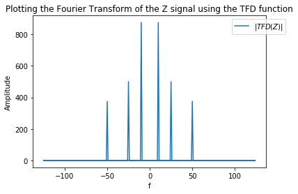
- 6) Custom Discrete Fourier Transform (DFT) Implementation
- 7) Timing Comparison: FFT vs Custom TFD
- Section 4: Audio Signal Filtering and Spectral Analysis
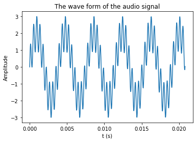
- 1) Visualizing the Audio Signal
- 2) Spectrum of the Signal and Identifying Disturbances
- 3) Cutoff Frequency Definition
- 4) Low-Pass Filtering to Remove High-Frequency Disturbance
- 5) High-Pass Filtering with Different Windows
- 6) Frequency Response of High-Pass Filters
- 7) Filtering the Low-Pass Filtered Signal with High-Pass Filters
- 8) Spectral Analysis of the Filtered Signals
- Project repository
Overview
This document provides a comprehensive exploration of 1D signal analysis and processing techniques using Python. It covers fundamental concepts such as the sinc function, harmonic decomposition, Fourier series, signal sampling, the Nyquist-Shannon theorem, and practical exercises involving filtering and spectral analysis of audio signals. Each section includes clear explanations and annotated code blocks to facilitate learning and application in signal processing projects.
Key Techniques and Concepts:
Secion 1: 1D Signal Analysis and Visualization
1) Plotting the Sinc Function
This section demonstrates how to generate and plot the normalized sinc function, a fundamental signal in signal processing. The sinc function is defined as $s(t) = \frac{\sin(\pi t)}{\pi t}$ and is plotted over the interval $t \in [-4, 4]$ with high resolution. Proper labeling and legends are included for clarity.
1
2
3
4
5
6
7
8
9
10
11
12
13
14
# Generate and plot the Sinc function
import numpy as np
import matplotlib.pyplot as plt

t = np.linspace(-4, 4, 1000)  # Defining t in the range of [-4;4] with a resolution of 1000 points.
s = np.sin(np.pi * t) / (np.pi * t)  # Defining function s(t).

fig, ax = plt.subplots()
ax.plot(t, s, label=r'$sin(\pi t)/\pi t$')  # Plot Sinc function
plt.title('Plotting the Sinc function')
plt.xlabel('t')
plt.ylabel('Amplitude')
plt.legend(bbox_to_anchor=(1., 0.9, 0.1, .1), shadow=True, ncol=1)
plt.show()
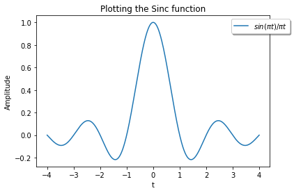
This signal is called the normalized sinc function, $Sinc(t) = \frac{\sin(\pi t)}{\pi t}$.
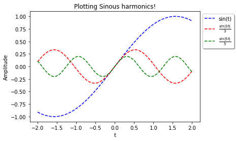
2) Plotting Sinusoidal Harmonics
This section explores the construction of complex signals by plotting three harmonics: $s_1 = \sin(t)$, $s_2 = \frac{\sin(3t)}{3}$, and $s_3 = \frac{\sin(5t)}{5}$ over $t \in [-2, 2]$. This illustrates the principle of harmonic decomposition.
1
2
3
4
5
6
7
8
9
10
11
12
13
14
15
# Generate and plot three sinusoidal harmonics
t = np.linspace(-2, 2, 500)
s1 = np.sin(t)
s2 = np.sin(3 * t) / 3
s3 = np.sin(5 * t) / 5

fig, ax = plt.subplots()
ax.plot(t, s1, '--', label='sin(t)', color='b')
ax.plot(t, s2, '--', label=r'$\frac{sin(3t)}{3}$', color='r')
ax.plot(t, s3, '--', label=r'$\frac{sin(5t)}{5}$', color='g')
plt.title('Sinusoidal Harmonics')
plt.xlabel('t')
plt.ylabel('Amplitude')
plt.legend()
plt.show()
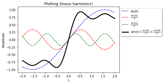
3) Summing Harmonics
The sum $s_1 + s_2 + s_3$ is plotted in bold to show how adding harmonics creates more complex waveforms.
1
2
3
4
5
6
7
8
9
10
11
# Plot the sum of the three signals
fig, ax = plt.subplots()
ax.plot(t, s1, '--', label='sin(t)', color='b')
ax.plot(t, s2, '--', label=r'$\frac{sin(3t)}{3}$', color='r')
ax.plot(t, s3, '--', label=r'$\frac{sin(5t)}{5}$', color='g')
ax.plot(t, s1 + s2 + s3, label='Sum', color='k', linewidth=3)
plt.title('Sum of Harmonics')
plt.xlabel('t')
plt.ylabel('Amplitude')
plt.legend()
plt.show()
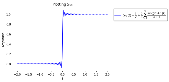
4) Partial Fourier Series: $S_{50}(t)$
This section demonstrates the use of the Fourier series to approximate a square-like signal by summing odd harmonics. The partial sum $S_{50}(t)$ is computed and plotted.
1
2
3
4
5
6
7
8
9
10
t = np.linspace(-2, 2, 500)
s_50 = 0.5 + 2 / np.pi * np.array([np.sin(k * t) / k for k in np.arange(1, 101, 2)]).sum(0)
fig, ax = plt.subplots()
legend_string = r'$S_{50}(t) = \dfrac{1}{2} + \dfrac{2}{\pi} \sum_{i=0}^{50} \dfrac{\sin((2i+1) t)}{2i+1}$'
ax.plot(t, s_50, label=legend_string, color='b')
plt.title('Plotting $S_{50}$')
plt.xlabel('t')
plt.ylabel('Amplitude')
plt.legend()
plt.show()
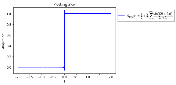
Try again but for $i$ from $0$ to $500$ ($k$ from $1$ to $1001$).
1
2
3
4
5
6
7
8
9
10
11
12
13
14
15
## Code ##
t = np.linspace(-2,2,500)  ## Defining t in the range of [-2;2] with a resolution of 500 points.

## Defining the function S_500.
s_500 = 0.5 + 2/np.pi * np.array([np.sin(k*t)/k for k in np.arange(1,1001,2)]).sum(0)

## Plot the signal
fig, ax = plt.subplots()
legend_string = r'$S_{500}(t) = \dfrac{1}{2} + \dfrac{2}{\pi} \sum_{i=0}^{500} \dfrac{\sin((2i+1) t)}{2i+1}$'
ax.plot(t, s_500, label= legend_string, color = 'b' )

plt.title('Plotting $S_{500}$')
plt.xlabel('t')
plt.ylabel('Amplitude')
plt.legend(bbox_to_anchor=(1., 0.9, 0.1, .1),shadow=True, ncol=1);
Section 2: Sampling and the Nyquist-Shannon Theorem
1) What is the maximum frequency present in the signal?
The signal is defined as:
\[Y(t) = 2\sin(165\pi t) + 13\cos(6\pi t) - 3\cos(80\pi t)\]The frequencies present are:
- $165\pi$ (which corresponds to $82.5$ Hz)
- $6\pi$ (which corresponds to $3$ Hz)
- $80\pi$ (which corresponds to $40$ Hz)
The maximum frequency is $82.5$ Hz.
2) What is the minimum sampling rate required to avoid aliasing?
According to the Nyquist-Shannon theorem, the minimum sampling rate $F_e$ should be at least twice the maximum frequency:
\[F_e \geq 2 \times 82.5 = 165 \text{ Hz}\]3) How does the sampling rate affect the shape of the signal?
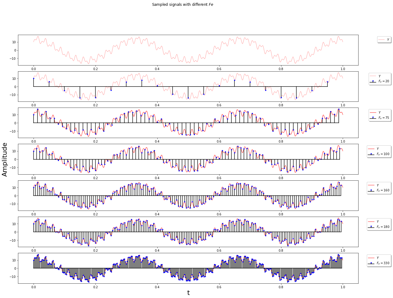
By using a low sample rate, the fast changes of the signal cannot be followed. By increasing the sampling rate, the sampled signal is closer to the source signal.
4) Among the proposed sampling rates, which ones satisfy the Nyquist-Shannon theorem?
The question is that, what trade-off must we do when choosing a sampling rate?
Sampling rates of $F_e = 180$ Hz and $F_e = 330$ Hz satisfy the Nyquist-Shannon theorem. The sampling rate should be at least twice the maximum frequency. In practice, the sampling switch speed and memory budget limit the upper bound of the sampling frequency. The trade-off is between these factors and the desire for a high sampling rate.
Code Example: Sampling and Visualization
This Figure demonstrates how the sampling rate affects the accuracy of signal representation. The signal Y(t) which is sampled at six different rates (20Hz, 75Hz, 100Hz, 160Hz, 180Hz, and 330Hz) and plotted using multiple axes stacked vertically for comparison. The continuous signal is shown in red, while discrete samples are visualized with stem plots. As the sampling rate increases, the sampled signal more closely matches the original, highlighting the importance of adequate sampling for capturing fast signal variations. Titles, axis labels, and legends are used for clarity.
1
2
3
4
5
6
7
8
9
10
11
12
13
14
15
16
17
18
19
20
21
22
23
24
25
26
27
28
29
30
31
32
33
34
35
36
37
38
39
40
41
42
43
44
45
46
47
48
49
50
51
52
53
54
55
56
57
58
59
60
61
62
63
64
65
66
67
68
69
70
import numpy as np
import matplotlib.pyplot as plt

t = np.linspace(0,1,1000) # For visualization of the continuous function.

# Defining different sampling rates.
Fe1=20
Fe2=75
Fe3=100
Fe4=160
Fe5=180
Fe6=330

# Defining different time domains.
t1 = np.arange(0,1,1/Fe1)
t2 = np.arange(0,1,1/Fe2)
t3 = np.arange(0,1,1/Fe3)
t4 = np.arange(0,1,1/Fe4)
t5 = np.arange(0,1,1/Fe5)
t6 = np.arange(0,1,1/Fe6)

# Defining functions for each sampling rate.
Y = 2*np.sin(165*np.pi*t) + 13*np.cos(6*np.pi*t) - 3*np.cos(80*np.pi*t)
S1 = 2*np.sin(165*np.pi*t1) + 13*np.cos(6*np.pi*t1) - 3*np.cos(80*np.pi*t1)
S2 = 2*np.sin(165*np.pi*t2) + 13*np.cos(6*np.pi*t2) - 3*np.cos(80*np.pi*t2)
S3 = 2*np.sin(165*np.pi*t3) + 13*np.cos(6*np.pi*t3) - 3*np.cos(80*np.pi*t3)
S4 = 2*np.sin(165*np.pi*t4) + 13*np.cos(6*np.pi*t4) - 3*np.cos(80*np.pi*t4)
S5 = 2*np.sin(165*np.pi*t5) + 13*np.cos(6*np.pi*t5) - 3*np.cos(80*np.pi*t5)
S6 = 2*np.sin(165*np.pi*t6) + 13*np.cos(6*np.pi*t6) - 3*np.cos(80*np.pi*t6)

# Plot
fig, (ax, ax1, ax2, ax3, ax4, ax5, ax6) = plt.subplots(7,1, figsize=(20, 10))

ax.plot(t, Y, '-', label= r'$Y$', color = 'r', linewidth=0.4 )
ax.legend(bbox_to_anchor=(1., 0.9, 0.1, .1), shadow=True, ncol=1)

ax1.plot(t, Y, '-',label= r'$Y$', color = 'r', linewidth=0.4)
stem_plt = ax1.stem(t1, S1, use_line_collection=False, label= r'$F_e = 20$');
plt.setp(stem_plt, color = 'k', markersize = 2, markeredgecolor = 'blue', markeredgewidth = 2)
ax1.legend(bbox_to_anchor=(1., 0.9, 0.1, .1), shadow=True, ncol=1)

ax2.plot(t, Y, '-', label= r'$Y$', color = 'r', linewidth=1 )
stem_plt = ax2.stem(t2, S2, use_line_collection=False, label= r'$F_e = 75$');
plt.setp(stem_plt, color = 'k', markersize = 2, markeredgecolor = 'blue', markeredgewidth = 2)
ax2.legend(bbox_to_anchor=(1., 0.9, 0.1, .1), shadow=True, ncol=1)

ax3.plot(t, Y, '-', label= r'$Y$', color = 'r', linewidth=1 )
stem_plt = ax3.stem(t3, S3, use_line_collection=False, label= r'$F_e = 100$')
plt.setp(stem_plt, color = 'k', markersize = 2, markeredgecolor = 'blue', markeredgewidth = 2)
ax3.legend(bbox_to_anchor=(1., 0.9, 0.1, .1), shadow=True, ncol=1)

ax4.plot(t, Y, '-', label= r'$Y$', color = 'r', linewidth=1 )
stem_plt = ax4.stem(t4, S4, use_line_collection=False, label= r'$F_e = 160$')
plt.setp(stem_plt, color = 'k', markersize = 2, markeredgecolor = 'blue', markeredgewidth = 2)
ax4.legend(bbox_to_anchor=(1., 0.9, 0.1, .1), shadow=True, ncol=1)

ax5.plot(t, Y, '-', label= r'$Y$', color = 'r', linewidth=1 )
stem_plt = ax5.stem(t5, S5, use_line_collection=False, label= r'$F_e = 180$')
plt.setp(stem_plt, color = 'k', markersize = 2, markeredgecolor = 'blue', markeredgewidth = 2)
ax5.legend(bbox_to_anchor=(1., 0.9, 0.1, .1), shadow=True, ncol=1)

ax6.plot(t, Y, '-', label= r'$Y$', color = 'r', linewidth=1 )
stem_plt = ax6.stem(t6, S6, use_line_collection=False, label= r'$F_e = 330$')
plt.setp(stem_plt, color = 'k', markersize = 2, markeredgecolor = 'blue', markeredgewidth = 2)
ax6.legend(bbox_to_anchor=(1., 0.9, 0.1, .1), shadow=True, ncol=1)

fig.set_figheight(15)
plt.suptitle('Sampled signals with different $Fe$')
plt.xlabel('t',  fontsize=22)
ax3.set_ylabel("Amplitude", fontsize=22);
Section 3: Composite Signals and Fourier Analysis
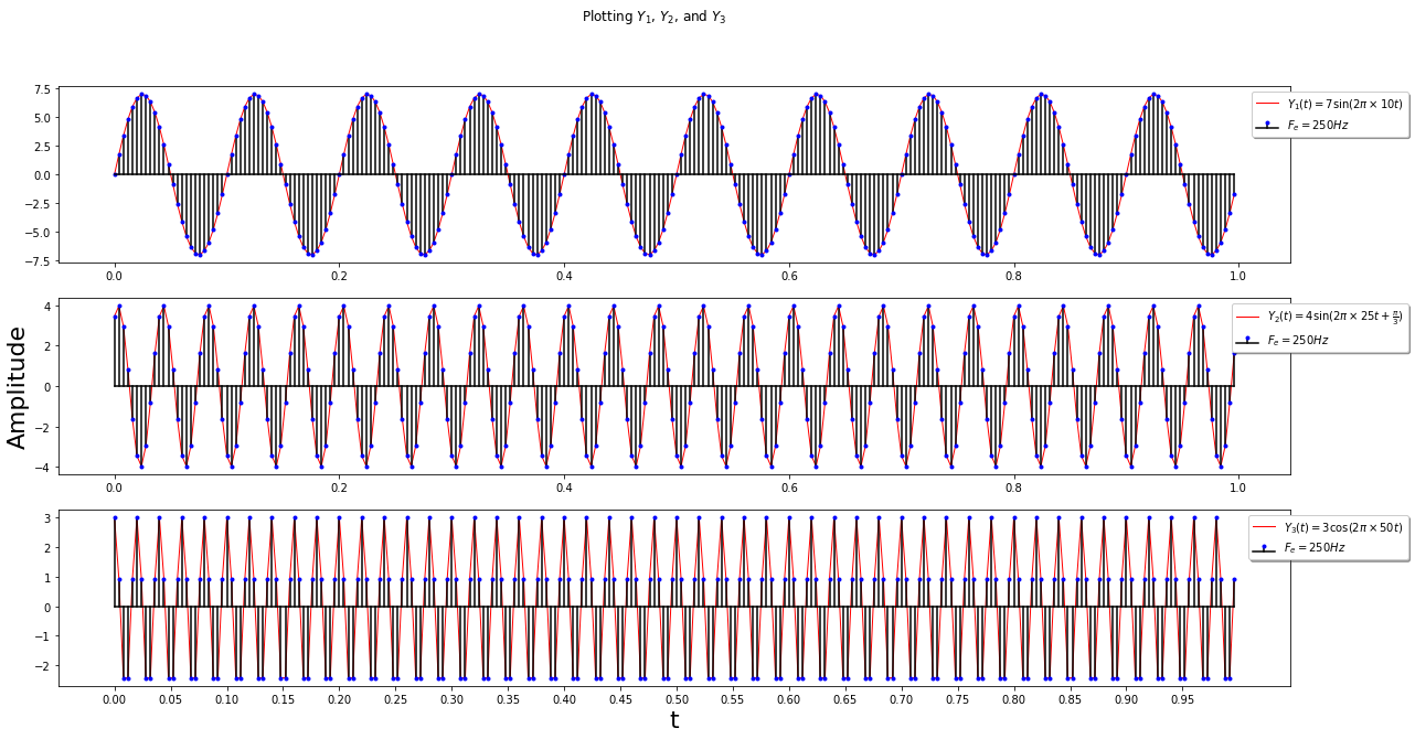
1) Plot the three signals $Y_1(t)$, $Y_2(t)$, and $Y_3(t)$
The signals are:
- $Y_1(t) = 7 \sin(2\pi \times 10 t)$
- $Y_2(t) = 4 \sin(2\pi \times 25 t + \frac{\pi}{3})$
- $Y_3(t) = 3 \cos(2\pi \times 50 t)$
Sampled at $F_e = 250$ Hz over $0 \leq t \leq 1$.
1
2
3
4
5
6
7
8
9
10
11
12
13
14
15
16
17
18
19
20
21
22
Fe = 250  # Sampling frequency (Hz)
t = np.arange(0, 1, 1/Fe)
Y1 = 7 * np.sin(2 * np.pi * 10 * t)
Y2 = 4 * np.sin(2 * np.pi * 25 * t + np.pi/3)
Y3 = 3 * np.cos(2 * np.pi * 50 * t)

fig, (ax1, ax2, ax3) = plt.subplots(3, 1, figsize=(20, 10))
ax1.plot(t, Y1, '-', label=r'$Y_1$', color='r')
stem_plt = ax1.stem(t, Y1, use_line_collection=False, label=r'$F_e = 250Hz$')
plt.setp(stem_plt, color='k', markersize=2, markeredgecolor='blue', markeredgewidth=2)
ax1.legend()
ax2.plot(t, Y2, '-', label=r'$Y_2$', color='r')
stem_plt = ax2.stem(t, Y2, use_line_collection=False, label=r'$F_e = 250Hz$')
plt.setp(stem_plt, color='k', markersize=2, markeredgecolor='blue', markeredgewidth=2)
ax2.legend()
ax3.plot(t, Y3, '-', label=r'$Y_3$', color='r')
stem_plt = ax3.stem(t, Y3, use_line_collection=False, label=r'$F_e = 250Hz$')
plt.setp(stem_plt, color='k', markersize=2, markeredgecolor='blue', markeredgewidth=2)
ax3.legend()
plt.suptitle('Plotting $Y_1$, $Y_2$, and $Y_3$')
plt.xlabel('t', fontsize=22)
ax2.set_ylabel('Amplitude', fontsize=22)
2) Period of Each Signal
Graphically and theoretically:
- $T_1 \approx 0.1$ (since $f_1 = 10$ Hz, $T_1 = 1/10$)
- $T_2 \approx 0.04$ (since $f_2 = 25$ Hz, $T_2 = 1/25$)
- $T_3 \approx 0.02$ (since $f_3 = 50$ Hz, $T_3 = 1/50$)
3) Plot the Composite Signal $Z(t) = Y_1(t) + Y_2(t) + Y_3(t)$
1
2
3
4
5
6
7
Z = Y1 + Y2 + Y3
fig, ax = plt.subplots()
ax.plot(t, Z, '-', label=r'$Z=Y_1 + Y_2 + Y_3$', color='r')
plt.suptitle('Plotting Z')
plt.xlabel('t')
plt.ylabel('Amplitude')
ax.legend()
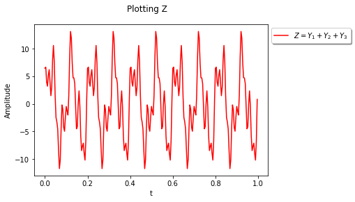
Graphically, $T \approx 0.2$ so $f = 5$ Hz. Analytically, the largest common divisor of $f_1 = 10$ Hz, $f_2 = 25$ Hz, $f_3 = 50$ Hz is $5$ Hz.
4) FFT of $Y_1$, $Y_2$, and $Y_3$
1
2
3
4
5
6
7
8
9
10
11
12
13
14
15
16
17
18
19
20
fft1 = np.fft.fft(Y1)
fft2 = np.fft.fft(Y2)
fft3 = np.fft.fft(Y3)
n = Y1.size
freq = np.fft.fftfreq(n, d=1/Fe)

fig, (ax1, ax2, ax3) = plt.subplots(3, 1)
ax1.plot(freq, abs(fft1), label=r'$|FFT(Y_1)|$')
ax2.plot(freq, abs(fft2), label=r'$|FFT(Y_2)|$')
ax3.plot(freq, abs(fft3), label=r'$|FFT(Y_3)|$')
ax1.legend()
ax2.legend()
ax3.legend()
ax1.set_xlabel('f')
ax1.set_ylabel('Amplitude')
ax2.set_xlabel('f')
ax2.set_ylabel('Amplitude')
ax3.set_xlabel('f')
ax3.set_ylabel('Amplitude')
plt.suptitle('Plotting the Fourier Transforms of the Y signals')
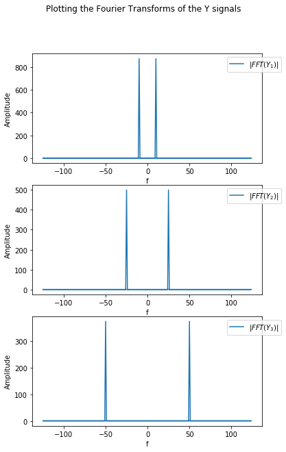
Each plot shows a single frequency at $\pm f_1$, $\pm f_2$, and $\pm f_3$.
5) FFT of the Composite Signal $Z(t)$
1
2
3
4
5
6
7
8
9
fft_z = np.fft.fft(Z)
n = fft_z.size
freq = np.fft.fftfreq(n, d=1/Fe)
plt.plot(freq, abs(fft_z), label=r'$|FFT(Y_1+Y_2+Y_3)|$')
plt.legend()
plt.xlabel('f')
plt.ylabel('Amplitude')
plt.title('Plotting the Fourier Transform of the Z signal')
plt.show()
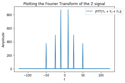
The Fourier transform of the composite signal contains $\pm f_1$, $\pm f_2$, and $\pm f_3$.
6) Custom Discrete Fourier Transform (DFT) Implementation
1
2
3
4
5
6
7
8
def tfd(s):
    N = len(s)
    S = np.zeros(N, dtype=complex)
    n = np.arange(0, N)
    exp_basis = np.exp(-2j * np.pi * n / N)
    for k in range(N):
        S[k] = np.sum(s * np.power(exp_basis, k))
    return S
Compare its output with the FFT on the composite signal:
1
2
3
4
5
6
7
8
9
tfd_z = tfd(Z)
n = tfd_z.size
freq = np.fft.fftfreq(n, d=1/Fe)
plt.plot(freq, abs(tfd_z), label=r'$|TFD(Z)|$')
plt.legend()
plt.xlabel('f')
plt.ylabel('Amplitude')
plt.title('Plotting the Fourier Transform of the Z signal using the TFD function')
plt.show()
7) Timing Comparison: FFT vs Custom TFD
1
2
3
4
5
6
import timeit
time_tfd = timeit.timeit(lambda: tfd(Z), number=100)
time_fft = timeit.timeit(lambda: np.fft.fft(Z), number=100)
print('The elapsed time for 100 executions of function TFD is :  %6f (s)' % (time_tfd))
print('The elapsed time for 100 executions of function FFT is :  %6f (s)' % (time_fft))
print('\nConclusion: The fft function is about %d times faster than tfd function' % (time_tfd/time_fft))
Conclusion: NumPy’s FFT is much faster than a raw DFT implementation, especially for large signals.
Section 4: Audio Signal Filtering and Spectral Analysis
1) Visualizing the Audio Signal
The original audio signal is plotted to observe its waveform. This helps identify the presence of disturbances (beep sounds) at different frequencies.
1
2
3
4
5
6
7
8
9
10
11
# Load and play a corrupted audio signal
samp_rate, orig_signal = wavfile.read('corrupted_audio.wav')  # Read WAV file, get sample rate and signal data
ipd.Audio(orig_signal, rate=samp_rate)  # Play audio in notebook using IPython display

# To visualize the cropped waveform
n = orig_signal.size
showing_samples = 1000  # For better visualization
plt.plot(np.arange(0, n/samp_rate, 1/samp_rate)[0:showing_samples], orig_signal[0:showing_samples])
plt.title('The wave form of the audio signal')
plt.xlabel('t (s)')
plt.ylabel('Amplitude')
2) Spectrum of the Signal and Identifying Disturbances
The spectrum of the audio signal is computed and plotted. By analyzing the spectrum, the frequencies of the disturbances can be identified.
1
2
3
4
5
6
7
8
9
10
11
12
13
14
15
16
fft_orig = np.fft.fft(orig_signal)
n = fft_orig.size
freq = np.fft.fftfreq(n, d=1/samp_rate)

fig, (ax1, ax2) = plt.subplots(1, 2, figsize=(15, 5))
ax1.plot(freq, abs(fft_orig))
ax2.plot(freq, abs(fft_orig))
ax1.set_xlabel('f')
ax1.set_ylabel('Amplitude')
ax1.set_title('The spectrum of the audio signal')
ax1.set_xticks(np.arange(-24000, 24001, 8000))
ax2.set_xlabel('f')
ax2.set_ylabel('Amplitude')
ax2.set_title('The spectrum of the audio signal (zoomed in)')
ax2.set_ylim((0, 4000))
ax2.set_xlim((-7000, 7000))
To identify the disturbance frequencies:
1
2
3
disturb = fft_orig > 15000
freq_ind = [freq[i] for i, x in enumerate(disturb) if x]
print(freq_ind)
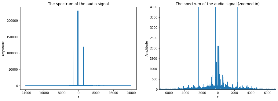
Two main disturbance frequencies are found: a low-frequency (261 Hz, note C) and a high-frequency (2349 Hz, note D).
3) Cutoff Frequency Definition
The cutoff frequency is where the transition band and passband meet, typically defined as the frequency at which the magnitude response is 3dB lower than the passband amplitude.
4) Low-Pass Filtering to Remove High-Frequency Disturbance
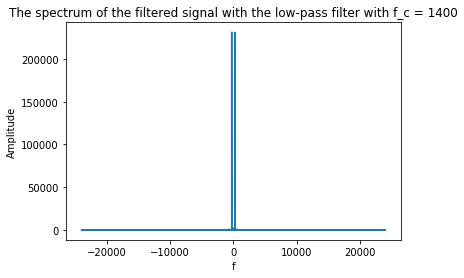
A low-pass FIR filter (order 128, cutoff 1400 Hz) is designed and applied to remove the high-frequency disturbance. The effect of varying the cutoff frequency is discussed.
1
2
3
4
5
6
7
8
9
10
11
12
13
14
15
16
from scipy.signal import firwin, lfilter
f_c = 1400  # Cut-off frequency (Hz)
Fe = samp_rate
# Design FIR low-pass filter
taps_lp = firwin(129, 2*f_c/Fe)
L_filt_signal = lfilter(taps_lp, 1, orig_signal)

fft_orig = np.fft.fft(L_filt_signal)
n = fft_orig.size
freq = np.fft.fftfreq(n, d=1/Fe)
plt.plot(freq, abs(fft_orig))
plt.xlabel('f')
plt.ylabel('Amplitude')
plt.title('The spectrum of the filtered signal with the low-pass filter with f_c = %d' % f_c)
plt.figure()
ipd.Audio(L_filt_signal, rate=Fe)
- If the cutoff frequency is too high, the parasite is not removed.
- If too low, both the parasite and part of the signal are lost.
- A band-stop filter would be more appropriate for a narrow-band disturbance.
5) High-Pass Filtering with Different Windows
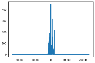
Three high-pass FIR filters (order 128, cutoff 750 Hz) are designed using Hamming, Blackman, and Chebyshev (30 dB attenuation) windows.
1
2
3
4
5
6
7
8
9
10
11
# Design high-pass FIR filters using different window functions
f_c = 750  # Cut-off frequency for high-pass filter (Hz)

# High-pass filter with Hamming window
taps_hamm = firwin(129, 2*f_c/Fe, window='hamming', pass_zero='highpass')

# High-pass filter with Blackman window
taps_black = firwin(129, 2*f_c/Fe, window='blackman', pass_zero='highpass')

# High-pass filter with Chebyshev window (30dB attenuation)
taps_cheb = firwin(129, 2*f_c/Fe, window=('chebwin', 30), pass_zero='highpass')
1
2
3
4
5
6
7
8
9
10
11
12
13
14
15
16
17
18
19
20
21
22
23
24
25
26
27
28
# Apply a high-pass FIR filter to the signal, visualize its spectrum and frequency response, and play the filtered audio
from scipy.signal import firwin, lfilter  # Import filter design and application functions
f_c = 700  # Cut-off frequency for high-pass filter (Hz)

# Design high-pass FIR filter with Hamming window
taps = firwin(129, 2*f_c/samp_rate, window='hamming', pass_zero='highpass')
filtered_signal_1 = lfilter(taps, 1, filtered_signal_1)  # Apply high-pass filter to signal

# Compute FFT of filtered signal for spectrum analysis
fft_orig = np.fft.fft(filtered_signal_1)
n = fft_orig.size  # Number of FFT points
freq = np.fft.fftfreq(n, d=1/samp_rate)  # Frequency bins for FFT

# Plot the spectrum of the filtered signal
plt.plot(freq, abs(fft_orig))  # Amplitude vs frequency
plt.figure()  # New figure for filter frequency response
w, h = signal.freqz(taps)  # Compute frequency response of filter
print(w.size)  # Print number of frequency bins
plt.semilogx(w, 20 * np.log10(abs(h)))  # Plot frequency response in dB (log scale)
plt.title('Chebyshev Type II frequency response (rs=40)')  # Title (note: filter is Hamming, not Chebyshev)
plt.xlabel('Frequency [radians / second]')
plt.ylabel('Amplitude [dB]')
plt.grid(which='both', axis='both')  # Add grid to plot
plt.axvline(750*2*np.pi, color='green')  # Mark cutoff frequency
plt.show()

# Play the filtered audio signal
ipd.Audio(filtered_signal_1, rate=samp_rate)
6) Frequency Response of High-Pass Filters
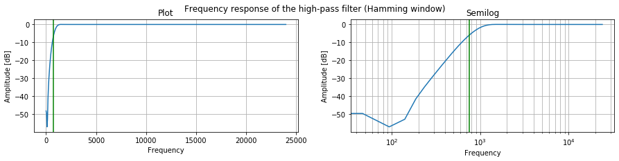
The frequency response of each filter is plotted using scipy.signal.freqz, with a vertical line at the cutoff frequency.
1
2
3
4
5
6
7
8
9
10
11
12
13
14
15
16
17
18
19
20
21
22
23
24
25
import scipy.signal as signal
# Hamming
w, h = signal.freqz(taps_hamm)
plt.plot(w/np.pi*Fe/2, 20 * np.log10(abs(h)))
plt.axvline(750, color='green')
plt.title('Frequency response (Hamming)')
plt.xlabel('Frequency')
plt.ylabel('Amplitude [dB]')
plt.grid()
# Blackman
w, h = signal.freqz(taps_black)
plt.plot(w/np.pi*Fe/2, 20 * np.log10(abs(h)))
plt.axvline(750, color='green')
plt.title('Frequency response (Blackman)')
plt.xlabel('Frequency')
plt.ylabel('Amplitude [dB]')
plt.grid()
# Chebyshev
w, h = signal.freqz(taps_cheb)
plt.plot(w/np.pi*Fe/2, 20 * np.log10(abs(h)))
plt.axvline(750, color='green')
plt.title('Frequency response (Chebyshev)')
plt.xlabel('Frequency')
plt.ylabel('Amplitude [dB]')
plt.grid()
The cutoff frequency is in the transition band; $f_c = 750$ Hz is the threshold between pass and stop bands.
7) Filtering the Low-Pass Filtered Signal with High-Pass Filters
The low-pass filtered signal is further filtered with each high-pass filter. The effect of varying the cutoff frequency is discussed.
1
2
3
4
5
6
ham_L_filtered_signal = lfilter(taps_hamm, 1, L_filt_signal)
ipd.Audio(ham_L_filtered_signal, rate=Fe)
blk_L_filtered_signal = lfilter(taps_black, 1, L_filt_signal)
ipd.Audio(blk_L_filtered_signal, rate=Fe)
chb_L_filtered_signal = lfilter(taps_cheb, 1, L_filt_signal)
ipd.Audio(chb_L_filtered_signal, rate=Fe)
- Chebyshev filter gives the best quality (highest SNR).
- If $f_c$ is too low, the parasite remains; if too high, signal is lost.
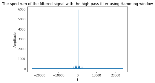
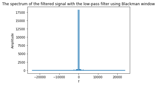
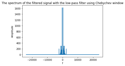
8) Spectral Analysis of the Filtered Signals
The DFTs of the signals filtered with the three high-pass filters are computed and plotted.
1
2
3
4
5
6
7
8
9
10
11
12
13
14
15
16
17
18
19
fft_ham_L = np.fft.fft(ham_L_filtered_signal)
n = fft_orig.size
freq = np.fft.fftfreq(n, d=1/Fe)
fft_blk_L = np.fft.fft(blk_L_filtered_signal)
fft_chb_L = np.fft.fft(chb_L_filtered_signal)
plt.plot(freq, abs(fft_ham_L))
plt.xlabel('f')
plt.ylabel('Amplitude')
plt.title('Spectrum: Hamming high-pass')
plt.figure()
plt.plot(freq, abs(fft_blk_L))
plt.xlabel('f')
plt.ylabel('Amplitude')
plt.title('Spectrum: Blackman high-pass')
plt.figure()
plt.plot(freq, abs(fft_chb_L))
plt.xlabel('f')
plt.ylabel('Amplitude')
plt.title('Spectrum: Chebyshev high-pass')
- The Chebyshev filter most effectively attenuates the parasite, resulting in the highest signal-to-noise ratio.
- The spectral analysis matches the listening test results.
Project repository
GitHub Code: Image Processing Project